Did you ever have the feeling that, if only you could talk in person with your user for 2 minutes, she would get hooked on your product?
As if creating digital products that people love is not hard enough, explaining the benefits of those products to people is even harder.
Mobile game analytics tell us that about 50 percent of users do not come back for a second session. This puts the pressure on the first encounter with the user, a.k.a. “the onboarding,” to be nothing short of magical.
The five key elements of a magical onboarding
Done right, the onboarding process would get people to:
- Understand what the app is about
- Fill in the needed details
- Understand how to use the app
- Begin a process
- See the magic moment
I chose two stellar apps to demonstrate the steps. Duolingo is an app for learning languages that has more than 100M users, and OkCupid is one of the biggest dating websites in the world.
#1 Element: Understand what the app is about (USP)
The onboarding unofficially starts on the app and the user’s first encounter. Be it a webpage or an app store page, this page has to convey a direct and clear message to the user.
At a single glance the user has to understand what the service is about and how she can benefit from it. Choosing the right wording and images here is crucial and a matter of seemingly endless A/B testing.
Duolingo
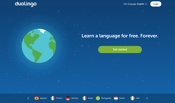
“Learn a language for free. Forever” is a strong USP that gets the message across in only five words. The image of the globe and the 6 flags at the bottom of the page complete the message that cannot be more clear.
OkCupid
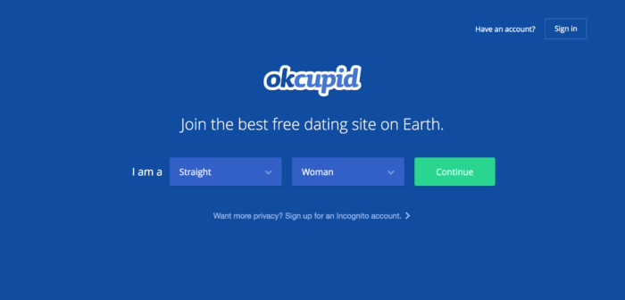
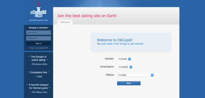
“Join the best free dating site on earth.” Doesn’t sound very unique but, hey, they have been using this tagline for over ten years now. And for a good reason: All the important words are there. It’s a dating service. It is one of the most popular dating services. The word “earth” insinuates it is a global service, and, yes, it is free! (A word that is at least as magical as Abra Cadabra).
#2 Element: Fill in the needed details (KYC)
The KYC (Know Your Customer) step is the necessary evil of every onboarding. All services have to get basic user data (name, email) at some point. However, some services have it worse than others.
As a digital matchmaker, OkCupid has to yank all sorts of personal data from its users (profile picture, sexual preferences, habits, etc.) to provide an effective service. Certainly not your trivial name and email forms.
To speed up the process and get users quickly into the dating groove, OkCupid begins with asking the user’s gender and sexual preferences right at the start, on the first page. (see the screenshot above). Answering the question (sometimes simply by tapping the big green “proceed” button) gets the user straight in the KYC path.
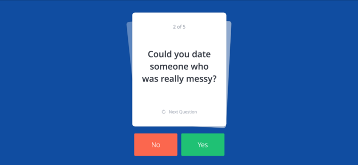
Now that the onboarding has officially started, OkCupid will do all within its power to transform the “fill in details” step from tedious to fun. Instead of bombarding users with forms, surveys, and questionnaires regarding their habits and other preferences, OkCupid takes the gamification approach and presents questions in the form of flashcards.
Each flashcard has a snappy, pajama party question on it that can be answered by swiping right for “yes” and left for “no.” Not only did I have fun answering those questions, it even felt that it ended too fast. This fun approach surely is a pearl in a sea of boring KYC forms and surveys.
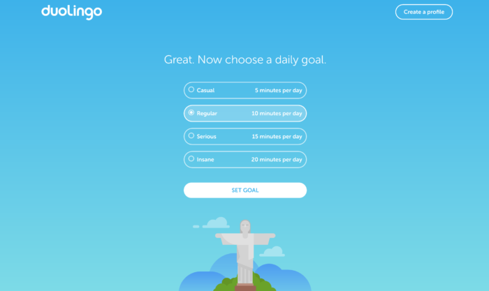
Duolingo needs far less data than OkCupid to be fully operational, so they will use the KYC step to snag a commitment out of the user. Right after asking users for their language of choice, Duolingo will inquire about the intensity of training the user had in mind.
This question achieves two things. The first, setting the frame around learning with Duolingo. Users can choose between 5 minutes of training per day (light) to 20 minutes per day (insane). Early on, Duolingo conveys the message that one would have to spend only a few minutes per day to learn a language. Appealing!
The second achievement here is engagment. By choosing the intensity level, the user, who 20 seconds ago did not know what Duolingo is, makes a silent commitment to get back on the wagon the day after. A smart move by Duolingo that serves as a good excuse “to call” the user via push notification the next day, and ask her to maintain her new language regimen.
3# Understand how to use the app
Another necessary evil of onboarding. Users have to learn how to use an app, and some apps are more complicated than others. I like to use the WOW (World of Warcraft) approach when onboarding users. WOW is a fairly complicated game with tons of UI elements. However, when users are just starting out playing the game, they are presented with only what they need.
This approach (I call it “evolving UI”) is now a standard also in non-game apps. For example, take a look at OkCupid’s home page in 2010 and the way it is now.
Although similar, notice how much cleaner the page is in 2016. The left column with the press citations is out, also the unnecessary login form (and forgot password button) are gone. The call to action was also refined and the “status” field was left out. We can clearly see how this narrows the user’s path, eliminating distractions as much as possible. All these options are available for the advanced user who is already engaged in the app.
There are still a lot of products out there that choose the “all out” approach, shoving all they got in the face of the user to show off abundance. This approach might prove useful on early adopters. The mainstream audience, however, will likely get overwhelmed.
#4 Begin a process
When the onboarding is officially over, the user should be up and running and in the midst of a process.
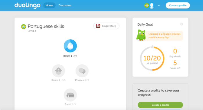
Duolingo excels in getting users quickly into the learning process, setting milestones, and zealously communicating progress along the way.
After a successful onboarding with Duolingo, pumped with energy on positive feedback for a successful language exercise, users find a dashboard with half-filled progress bars. Those progress bars are “begging” to be filled.
The next day, when the user gets a notification to come back and complete those exercises, they should not feel surprised or irritated. Some might be even eager to continue their learning.
OkCupid’s process actually begins during the KYC (Know Your Customer) step. If OkCupid indeed managed to get the user’s data and photos, they would make sure this user gets a message from one of the other members sooner rather than later.
A personal message from another user is the best way to make sure users are back in the service.
The magic moment – internalizing the value
Eventually, at a certain magical, elusive point, the user gets it. Maybe she got a message from someone she fancies on OkCupid, maybe she was able to have a small chat with her Brazilian neighbour. This magic moment where the user gets hooked on an app might take days, even more. But its roots are in the onboarding we just discussed.
Users will understand quickly what the app is about, fill in the needed details in the KYC step, understand the ropes and how to navigate through the app, and begin a process they would be called upon to complete the day after the first launch.
Then, maybe, the magic occurs and the user is engaged.
Happy onboarding everyone.

good job. it’s awesome
Thank you Alex! I’m glad yo discovered this post 🙂